UNC Research Typography
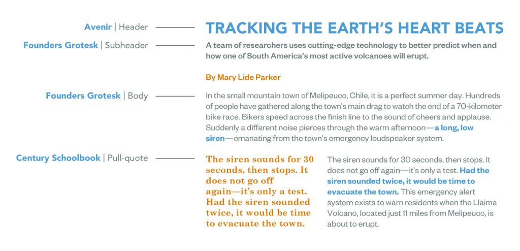
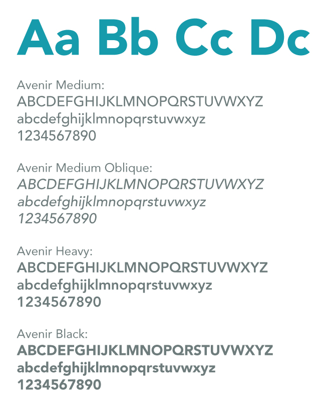
Avenir
The typeface Avenir has been chosen to be the lead with all brand messaging for UNC Research including headlines and display copy. This has been carefully selected to best represent the brand image and must be used to retain consistency.
Primary Usage: Headers
Secondary Usage: Subheaders
Weights: Medium, Medium Oblique, Heavy, & Black
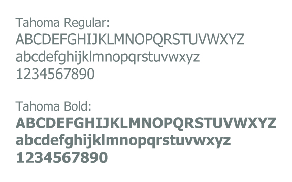
In situations when Avenir cannot be used, such as word documents, powerpoint and other presentations, HTML emails, native apps and other documents that cannot be distributed electronically as PDFs, the Tahoma should be used.
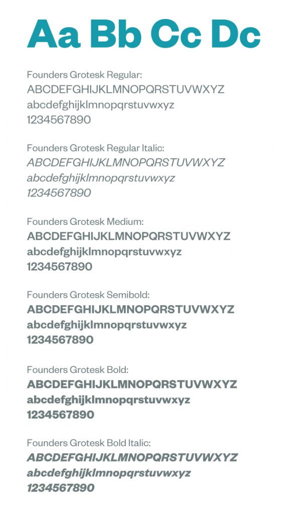
Founders Grotesk
The typeface Founders Grotesk has been chosen to be the secondary font. All body copy or paragraphs where lots of text is needed will be set in this typeface. Where appropriate, this typeface could be used for subheads as a compliment to the primary typeface, Avenir.
Primary Usage: Bodycopy
Secondary Usage: Subheaders
Weights: Regular, Regular Italic, Medium, Semibold, Bold, & Bold Italic
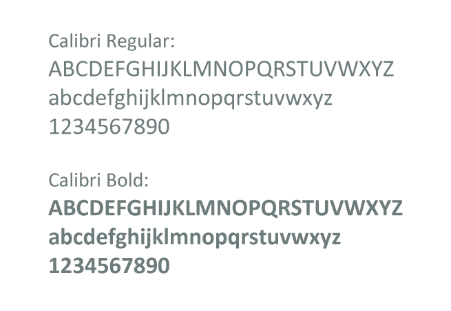
In situations when Founders Grotesk cannot be used, such as word documents, powerpoint and other presentations, HTML emails, native apps and other documents that cannot be distributed electronically as PDFs, the Calibri should be used.
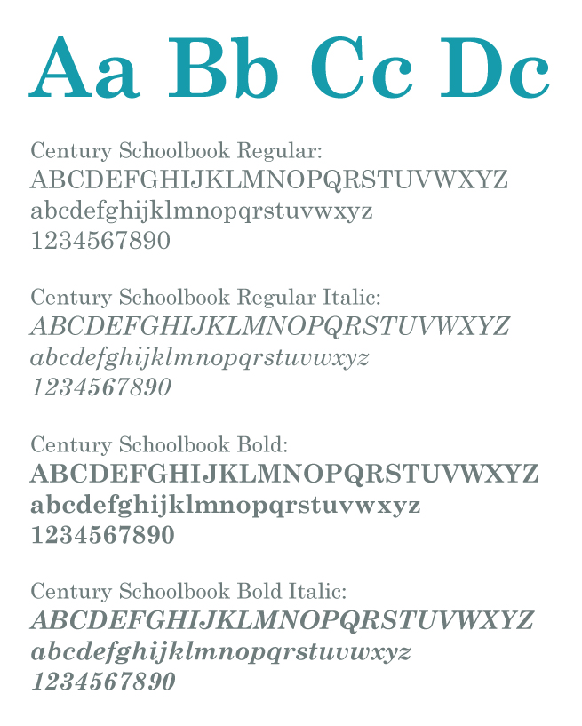
Century Schoolbook
The typeface Century Schoolbook has been chosen to be the secondary font for print publications. Paragraphs in large blocks of text are to be set in this typeface. Where appropriate in web publications, this typeface could be used as for pull-quotes as a compliment to the Founders Grotesk.
Primary Usage: Bodycopy
Secondary Usage: Pull-quotes
Weights: Regular, Regular Italic, Bold, & Bold Italic
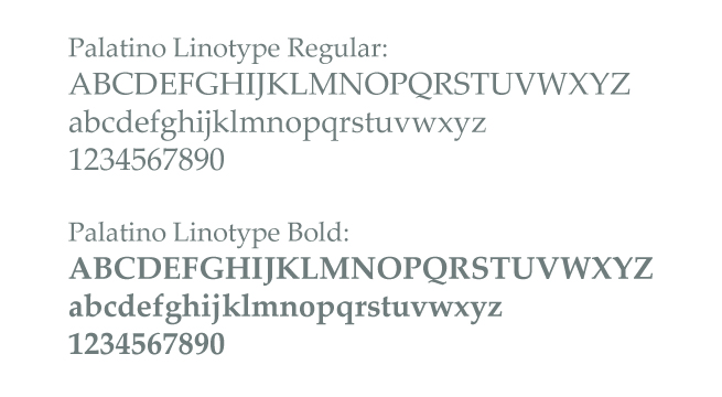
In situations when Century Schoolbook cannot be used, such as word documents, powerpoint and other presentations, HTML emails, native apps and other documents that cannot be distributed electronically as PDFs, the Palatino Linotype should be used.
Typography Usage Guidelines
|
|
Sample